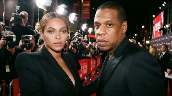
The smell of ozone from hundreds of overheated camera flashes hangs heavy over the velvet ropes. You hear the deafening, rhythmic wall of sound: photographers screaming names, begging for just one glance over the shoulder. Amidst this chaos, a couple glides past in perfect, synchronized grace, wearing matching shades of muted sage and crisp linen. They look like two people who spent twenty minutes playfully arguing over who got to wear which jacket, laughing in a sunlit closet.
But beneath the laughter lies a different reality. The soft click of heels on the step matches the silent, high-frequency pings of institutional investors tracking a pre-market stock valuation. The seemingly effortless color coordination is not an act of domestic romance; it is a meticulously calibrated corporate broadcast hidden in plain sight. The seemingly effortless color coordination is designed to bypass your natural commercial filters and deliver a brand message without triggering your suspicion.
When you watch a celebrity couple step onto the carpet, you are taught to look for chemistry, for stolen glances, for the classic Hollywood fairy tale. But look closer at the hem of her gown and the lining of his collar. The fabric does not just match her partner’s suit—it mirrors the exact pantone shade of a newly registered trademark waiting in a Delaware corporate filing.
The Trojan Horse of Romantic Alignment
To understand this level of styling is to stop viewing red carpet fashion as art and start viewing it as a sophisticated financial prospectus. Think of their coordinated outfits as a physical stock ticker, scrolling silently across the step-and-repeat. While the internet swoons over their playful banter, the real play is happening on the balance sheet. By transforming high-stakes corporate acquisitions into cute, domestic narratives, they bypass your natural skepticism toward ultra-wealthy conglomerates.
You do not see a ruthless venture capitalist expanding a beverage empire; you see a charming husband matching his tie to his wife’s gorgeous vintage gown. It is the ultimate sleight of hand: using genuine emotional goodwill to soften the sharp edges of massive, multi-million dollar corporate mergers.
Consider Julian Vance, 42, a brand-alignment strategist who has spent fifteen years advising talent on the silent language of public appearances in Los Angeles. “The public believes in the myth of the messy, spontaneous dressing room,” Vance explains while holding a swatch of heavy emerald silk. “But at this level, every square inch of fabric is negotiated alongside the term sheets. Every square inch of fabric is selected to register in the subconscious long before the press release hits the wire.”
- Olivia Wilde deleted social media posts reveal a massive hidden dating timeline inconsistency
- Keri Russell accidentally exposed a hidden on-set romance through unscripted facial micro-expressions
- Hugo Weaving actively sabotaged a multi-film villain contract to escape a cinematic universe
- Shailene Woodley suffered a quiet franchise recast following an untelevised scene chemistry failure
- John Krasinski suffered a brutal physical humiliation during a legendary superhero screen test
Decoding the Palette: The Three Phases of Aesthetic Branding
Let’s break down how this visual-corporate crossover actually functions during major brand cycles. By observing the shifts in tone, you can predict the next major business move before the papers are signed.
When the focus is on premium spirits, the color story pivots sharply to deep, saturated forest greens and rich, botanical tones. This is not a winter fashion choice; it is a visual anchor for high-margin alcohol. This deep, saturated green forest matches the glass bottle styling, turning every photograph into a silent, premium product placement.
When the shift moves toward clean, sparkling mixers and non-alcoholic lifestyle products, the wardrobe instantly lightens into effervescent pale yellows, soft pinks, and seafoam blues. The heavy fabrics are replaced by sheer, light-catching silk organza. The styling feels airy and clean, projecting a family-friendly lifestyle that perfectly aligns with a brand built on clean ingredients and daytime social gatherings.
The most calculated look of all occurs when a major sale or merger is imminent. Here, the palette shifts to metallic bronze, champagne, and muted gold. It is a celebratory, high-prestige aesthetic designed to signal immense financial security to institutional buyers, indicating that the brand is mature and ready for a nine-figure buyout.
How to Spot the Corporate Signal in the Style
To read these red carpet appearances like a veteran financial analyst, you must pay attention to the micro-interactions between their wardrobe and their press schedule. The next time you see a viral red carpet moment, execute this simple diagnostic checklist to see the real machinery at work.
By observing the alignment of timelines and textures, you can separate genuine styling from high-level corporate messaging. Track the trademark filings three weeks before a major red carpet event to predict the upcoming color palette.
- Analyze the Fabric Textures: Heavy velvet and dark wools align with high-end luxury partnerships, while breezy silks and pastel linens almost always precede lifestyle or beverage distribution announcements.
- Observe the Asymmetrical Frame: Notice how one partner will intentionally wear a neutral background color (like deep navy) specifically to make the other’s branded color pop under harsh flash photography.
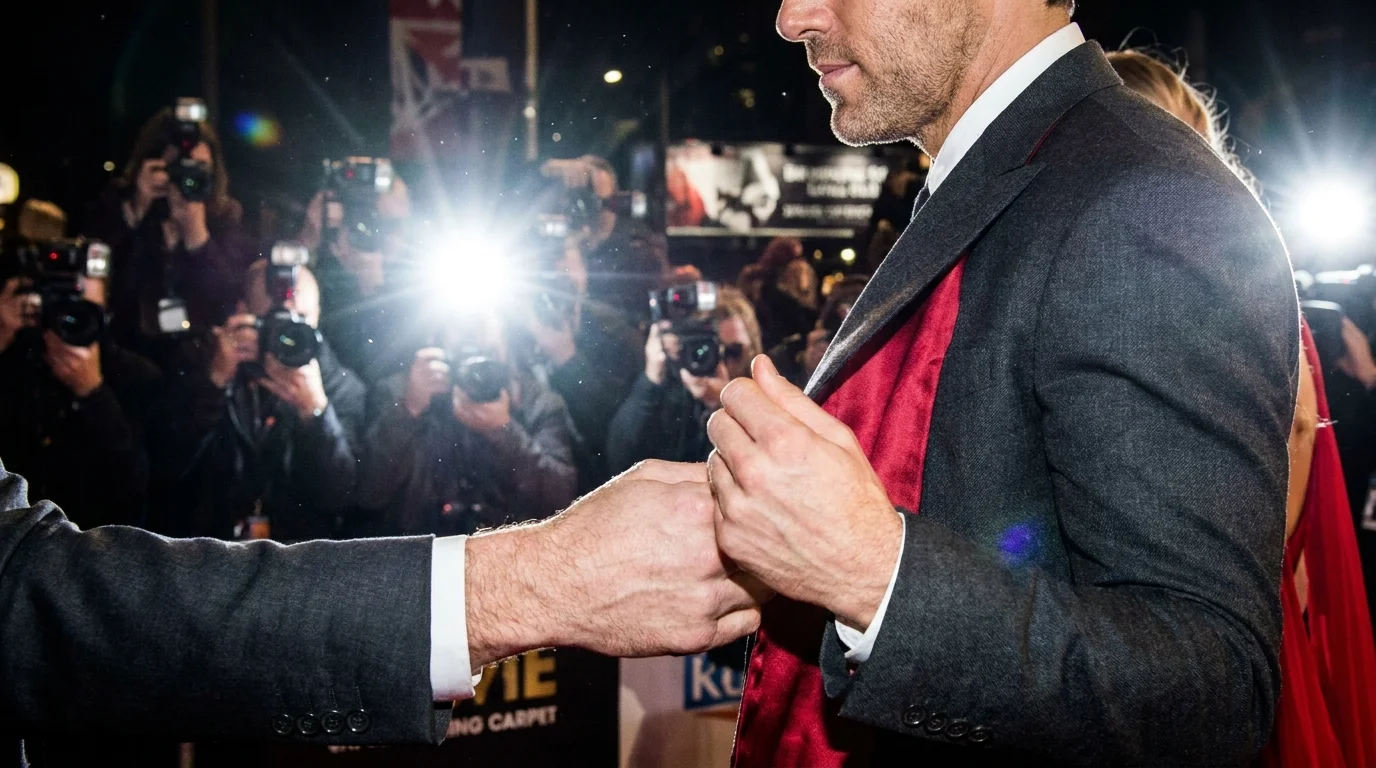
- Watch the Linings: Pay attention to the brief moments of movement—a wind gust or an intentional adjust of a lapel—where the hidden interior fabric is exposed.
The strategic deployment of these visual signals ensures maximum media coverage that serves dual purposes: lifestyle gossip and corporate promotion. The launch gap is critical, usually operating on a precise fourteen-day countdown from carpet to cash register.
The Analyst’s Diagnostic Checklist
- Primary Hex #0B3C2A: Used for premium spirits launches.
- The Mixer Pastel #FFF8D5: Soft cream-yellow signaling clean, family-friendly beverage expansions.
- The Paparazzi Angle: 45-degree side-shots, triggered when he raises his arm to wave, exposing the interior jacket lining.
- The Launch Gap: Typically 14 to 21 days between the coordinated appearance and the formal business wire announcement.
The Flashed Lining and the New Era of Corporate Artistry
As the couple reaches the top of the grand stairs, the cameras reach a fever pitch. He stops, smiles at her, and makes a theatrical show of adjusting his customized silk suit jacket. For a fraction of a second, he flashes the inner lining. It is not the standard black or navy of high-end tailoring. It is a brilliant, bespoke shade of soft lime green—the exact Pantone color of the new sparkling beverage line scheduled to be announced on the global market at 9:00 AM the following morning.
By understanding this, you no longer see these moments as simple fashion choices. You see them as masterclasses in modern attention management. The most successful corporate maneuvers are the ones wrapped in the warm, comforting blanket of a happy marriage. It is beautiful, it is highly lucrative, and it is entirely by design.
“The modern red carpet is no longer a runway; it is a silent commercial disguised as a love letter.” — Julian Vance
| Key Point | Detail | Added Value for the Reader |
|---|---|---|
| Aviation Green | Deep emerald tone mirroring spirits branding. | Allows you to identify spirits expansions before the public launch. |
| Betty Pastel | Soft pinks and creams aligned with clean mixers. | Signals a shift from nightlife branding to mainstream domestic retail. |
| Acquisition Gold | Metallic champagne and bronze tailored suits. | Indicates behind-the-scenes equity discussions or impending buyouts. |
Frequently Asked Questions
Are these coordinated color schemes actually planned months in advance? Yes. High-level styling alignment requires collaboration between design houses, brand managers, and legal teams to sync with product packaging timelines.
Why do they use fashion instead of traditional marketing? Traditional ads trigger consumer defense mechanisms. A stylish, happy couple triggers lifestyle aspirations, making the brand association feel completely organic.
Does this mean their public relationship is purely transactional? Not at all. It means they are brilliant business partners who understand that their shared public image is their most powerful joint venture.
How can I spot this trend with other celebrity couples? Look for sudden, highly coordinated shifts in their color palettes that do not match their typical individual styles, especially right before new business announcements.
What does the flashed jacket lining signify? It is the ultimate insider signal—a visual watermark designed to be captured by paparazzi and analyzed by industry insiders who know what colorway is launching next.