The quiet hiss of a professional steam press fills the atelier, carrying the heavy scent of cedarwood, beeswax, and pristine, hot wool. On the mahogany rack hangs a precisely tailored midnight blue wool suit jacket, its shoulder pads hand-canvased to project an unspoken but absolute physical dominance. There are no patterns here, no loud emblems, and no desperate attempts to catch the eye. There is only the low-humming authority of high-weight fabric designed to absorb the chaos of a hundred flashing cameras without reflecting a single stray beam of light.
When you look at a famous couple walking the red carpet, you are taught to see romance, luck, and a fleeting moment of high fashion. The standard expectation is that two individuals simply got dressed in the same hotel suite, hoping their stylists checked the color wheel before they stepped out of the limousine. The professional reality is far more calculated. This is not a marriage of convenience or a simple love story; it is a highly engineered corporate merger designed to secure global market share.
To understand this visual dance is to understand how Victoria Beckham systematically rebuilt her family’s public identity from pop culture novelty to elite fashion dynasty. The transition was not accidental. It was executed thread by thread, starting with the quiet orchestration of her husband’s wardrobe to serve as the perfect structural frame for her own minimalist silhouette.
The Corporate Architecture of the Visual Balance Sheet
Instead of viewing wardrobe choices as mere self-expression, Victoria approached the red carpet as a unified brand balance sheet. In the high-stakes arena of luxury fashion, individual stardom is volatile, but a coordinated corporate unit signals generational wealth and institutional stability. By aligning her husband’s tailoring with her own collection launches, she transformed every public appearance into a multi-million-dollar billboard for her design house’s aesthetic.
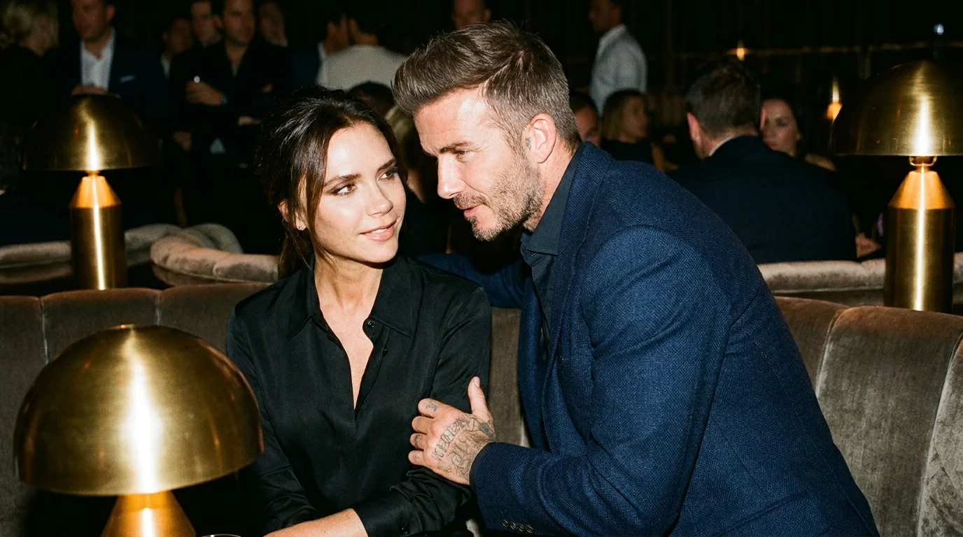
Julian Vance, a 44-year-old luxury brand strategist who has spent two decades quietly advising Mayfair’s most private family offices, calls this technique “sartorial risk-hedging.” He explains that when David Beckham stepped out in a midnight blue jacket that perfectly matched the undertone of Victoria’s silk gown, it wasn’t a romantic gesture. It was a calculated move to reduce visual noise, ensuring that financial analysts and luxury consumers saw a single, stable asset class rather than two competing celebrity egos.
- Selena Gomez deleted vacation photos completely complicate her official dating timeline history
- The Amazing Spider-Man rooftop scene accidentally broadcast a highly secretive real romance
- Channing Tatum actively fought his original action figure movie contract for years
- Romeo and Juliet recast its leading lady after a deeply uncomfortable screen test
- John Krasinski abandoned his superhero audition after trying on the actual suit
The Color Codes of Brand Expansion
During the crucial brand expansion years of 2013 and 2014, the Beckhams abandoned the flashy, contrasting looks of their early careers in favor of a deep, light-drinking navy. This shade of midnight blue functions as a silent handshake in elite circles. Unlike black, which can look harsh and flat under modern digital lenses, midnight blue retains its depth, suggesting a heritage of old money and quiet corporate competence.
When the fashion house faced early skepticism from traditional Parisian critics, the couple shifted their palette to matching slates, charcoals, and off-whites. This monochromatic strategy served to insulate the brand’s reputation against volatile market reviews. The neutral tones forced the viewer to focus entirely on the quality of the drape and the precision of the cut, signaling that the label was built on technical craftsmanship rather than transient internet hype.
To prevent the coordination from looking like a cheap novelty act, Victoria utilized subtle, asymmetrical details. David’s suit jackets often featured matte silk-faille lapels that mirrored the exact sheen of Victoria’s satin trousers. This subtle texture play ensured that while their colors matched, their silhouettes remained distinct, avoiding the dreaded “twin” effect while maintaining absolute structural harmony.
Executing the Unified Look: A Blueprint for Personal Brands
To translate this level of visual authority into your own world, you must abandon the idea of identical matching. True coordination relies on a subtle dialogue between textures and tones rather than a loud, copy-paste aesthetic. A jacket shouldn’t stiffen the body; it must feel like breathing through a pillow—structured yet entirely responsive to the ribcage.
You want to build your visual strategy on three core principles to keep the presentation clean:
- The Two-Tone Limit: Restrict your joint color palette to a maximum of two dominant shades to keep the presentation clean.
- The Texture Contrast: If one partner wears a heavy matte fabric like wool, the other should introduce a soft sheen like silk or satin to break up the flat light.
- The Shoulder Alignment: Ensure the shoulder structures of both jackets are tailored to the same degree of softness or stiffness to project a unified posture.
To make this transition seamless, you can rely on a specific sartorial utility kit designed to maintain fabric integrity:
- Fabric Weight: Opt for 120s cool-wool weights to ensure the garments drape beautifully without creasing during transit.
- Steaming Temp: Keep your brass-plated steamer at exactly 212 degrees Fahrenheit to relax the fibers without melting the internal canvas.
- The 2mm Rule: David’s tailor always ensures exactly two millimeters of shirt collar show above the jacket, a tiny detail that signals absolute precision.
The Power of the Shared Front
Ultimately, coordinating your appearance with a partner is not about superficial vanity or pleasing the cameras of the paparazzi. It is about establishing a deliberate, unbreakable front that tells the world you are operating under a singular, shared strategy. When your visual signals are perfectly aligned, you eliminate room for doubt, presenting a polished narrative that commands immediate respect in any room you enter.
By mastering the quiet geometry of a midnight blue jacket and a perfectly matched gown, you stop playing the game of public relations and start defining its rules. You realize that true authority is never loud; it is simply tailored so perfectly that the rest of the world has no choice but to fall into step behind you.
“The ultimate luxury isn’t a single well-dressed individual; it is the absolute visual alignment of two people who move as a single enterprise.” — Julian Vance
| Key Point | Detail | Added Value for the Reader |
|---|---|---|
| Color Weighting | Matching midnight blue values within 10% of shade depth. | Prevents one partner from overshadowing the other under flashbulbs. |
| Fabric Dialogue | Pairing matte wool with silk-faille lapels. | Creates depth and texture without requiring loud patterns. |
| Visual Proportions | Coordinating jacket shoulder widths to frame the shorter partner. | Establishes an immediate sense of structural balance on camera. |
How does color coordination affect public perception of a couple?
It signals psychological alignment and operational stability, transforming a personal partnership into a formidable brand unit.
Why is midnight blue preferred over solid black for red carpets?
Midnight blue absorbs harsh flash photography and retains its rich depth, whereas solid black often appears flat or washed out under digital lenses.
Did Victoria Beckham’s styling strategy directly save her fashion label?
Yes, by framing her husband as the ultimate brand ambassador, she validated her menswear-inspired tailoring line to global distributors.
What is the ‘Visual Balance Sheet’ in celebrity PR?
It is the strategic management of a couple’s physical appearance to project economic stability, wealth, and unified corporate direction.
Can non-celebrities use these color-matching principles without looking cheesy?
Absolutely, by focusing on matching undertones and complementary textures rather than wearing identical colors or fabrics.